After years of discussing book cover art, Sal and I finally seem to have a forum for our arguments. We’ve squabbled over the use of minimalism and its merits; its best use in the American cover of J.M. Coetzee’s “Disgrace.” It’s mainly been his reluctance for simplicity against my affinity towards empty space. Seeing as he and I have always been advocates for well thought out covers that are masterfully executed—it’s safe to say we both despise film poster covers for novels—it seems best that I present a cover he suggested to me:

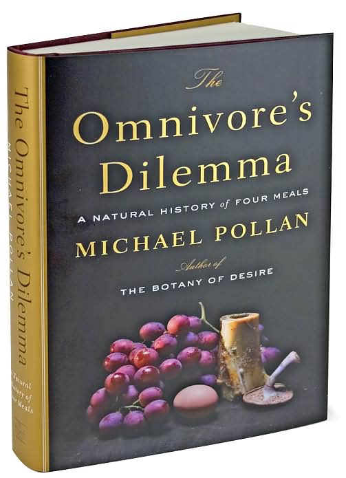
The Omnivore’s Dilemma
Author: Michael Pollan
Designer: Darren Hagger
Photographer: Hans Gissinger
As an avid photographer, it’s ironic that I don’t like covers consisting solely of a single photograph. I need stylization, thought—something that doesn’t look like it was ripped from a stock-photo bin. The color scheme is interesting. It’s drab and the still life is rather unappetizing but I think those points are reflective of the themes of the work. I commend those choices.
The fonts were well executed too. For a small amount of words, they seem to balance large caps, italics, and regular fonts in a good way. The changes don’t distract from the words on the cover.
I believe Sal was reading the hardbound print of Pollan’s work. I am not a fan of hardbacks in general—I enjoy a good flexible cover, preferably one that can fit in my back pocket—but the gold spine makes the whole work look elegant and would add a touch of class to a bookshelf. I wish Barnes and Noble could show me a picture of the book without a jacket on it.
Any takers?
Side Note: Michael Pollan reminds me of Michael Palin and I cannot help but think the title “The Omnivore’s Dilemma” would have only made for a hilarious sketch on Monty Python’s Flying Circus.