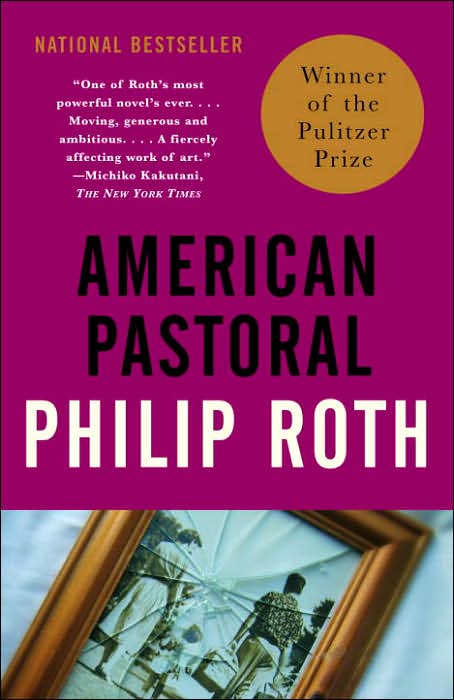
American Pastoral
American Pastoral
By Philip Roth
Cover Design and Photograph by gray318
Vintage International
I enjoy what Vintage has done with Philip Roth’s collection. I think the stark colors along with the thematic picture towards the bottom have really created an eye-catching set of works. The font, however, is rather plain and I am not sure if that really adds anything to the novel. The caps just leave the center of the cover rather bleak but in a way powerful—I blame the imprint. The broken frame is an obvious choice for American Pastoral but it is also the best.
The other covers for this title just don’t seem to capture what happens to Levov’s as well as this one. Using a picture of a family is just not enough and the torn American flag version just seems to miss where the true element of the story lies.
Any takers?


1 Comments:
I also love what Vintage International is doing with the Roth books. I am led to believe that it was started with Milton Glaser's design of 'The Plot Against America', which Vintage eventually used themselves. The bold name and title - of equal size - is smart and intelligent especially for Roth books, which are as powerful as their design suggests. The font isn't decorative because the story, albeit long, has no decorative frills. It's a much closer match than the US design of JM Coetzee's name.
Houghton Mifflin, the company that owns the hardback editions, generally does a horrible job at designing Roth covers. Here is theirs for 'American Pastoral'. It's cheezy and downright boring. You can see how Vintage adopted the concept and improved.
That being said, Roth's new novel, 'Exit Ghost' (Houghton Mifflin), looks wonderful; meanwhile 'Everyman' (Vintage) looks ridiculous.
Post a Comment
<< Home